A bilingual site for a dental group with three locations
A dental group with three locations in Sofia has two different problems on the same website. One is trust: the patient chooses a doctor, not a service. The other is logistics: three sites with different opening hours and different addresses, and a patient looking for the most convenient one.
This is how we built the site that answers both, what we would do differently, and why the interesting part turned out to be the admin panel rather than the home page. The client is not named here by agreement; the pictures are sample data.
One page, six addresses
The site is a single scrolling page, and every section of it has its own URL: services, prices, packages, aesthetic procedures, team, contact. A patient scrolls; a search engine sees six addressable pages, each with its own title and description. Detail pages hang off those sections: one per service, one per aesthetic procedure, one per blog post, all edited by the clinic in the admin panel rather than by us.
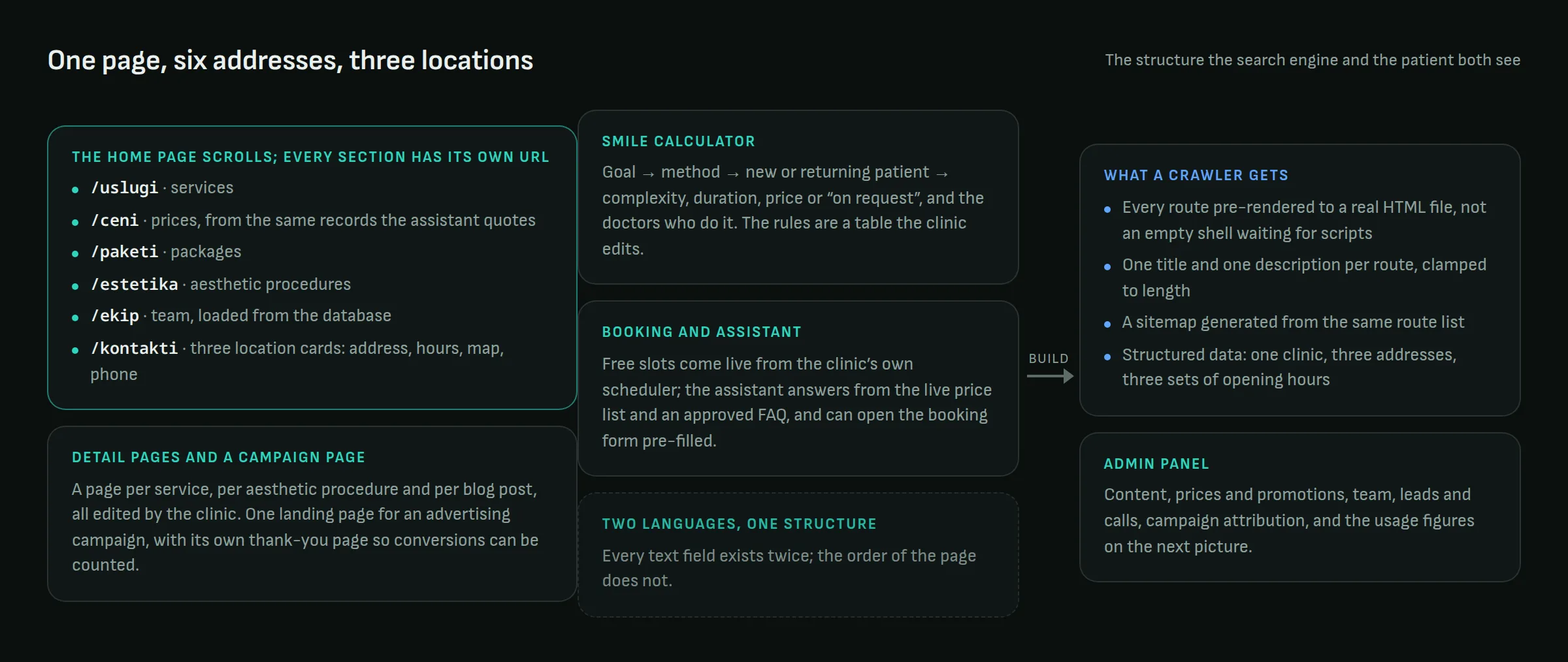
The three locations are cards in the contact section rather than separate pages: address, hours, a map, a phone number, a photo. We considered a page per location and decided against it. What a patient searching for "dentist near me" needs is the address and the hours, and what the search engine needs is those same facts in machine-readable form. So the structured data on the page describes one clinic with three addresses and three sets of opening hours, and the thin per-location page that would exist only to rank was left unbuilt. The clinic is one brand with one published number; the site says so.
A calculator that says "estimate"
The most-used part of the site is the treatment calculator. Pick a goal (whiter, straighter, a missing tooth, a full makeover), a method that fits it, whether you are a new or a returning patient, and the page shows a complexity score, a typical duration, a price or "on request", and the doctors who do that treatment.
Its point is not accuracy to the euro. Its point is that "how much will this cost" is the first question almost every patient has, and it usually goes unanswered until they are already in the chair. A site that gives a rough frame up front surfaces mismatches early, which is good for the patient and good for the clinic.
The key word is "rough". A calculator that presents itself as a quote creates an argument in the chair. One that says honestly that it is an estimate creates a conversation, so the disclaimer sits directly under the price, not in the footer. The rules behind it are a table the clinic edits: change a price, add a method, hide a price by clearing the field, and the calculator follows without a deployment.
Booking from live availability
The booking form does not collect a wish and e-mail it. It asks the clinic's own scheduling system for free slots, shows the doctors qualified for the chosen procedure, and places a short provisional hold on the slot the patient picks. Prices come from the same system; a procedure with no price set renders as "on request", never as zero.
One detail we insisted on: a doctor's flag for working with the national health fund is shown as a fact about the doctor, not as a promise that a given visit is covered, because the fund covers a capped set of procedures per year and the site cannot know what a patient has left. Small wording, large difference in the chair.
An assistant that reads the price list
The site has a chat assistant, and it is the kind that works: it answers from the live price list and an FAQ the lead doctor approved word for word, it can check availability and open the booking form pre-filled, and it hands emergencies to the phone number in the first sentence. Why that shape, and what it caught before patients did, is a separate piece.
SEO as part of the build, not after it
The site is a modern JavaScript application, which is exactly the kind of site search engines struggle with. So the build step renders every route to a real HTML file: a crawler, or an AI engine, gets the content and the metadata without running a line of script. The sitemap is generated from the same route list the pages are built from, so the two cannot disagree, and each route gets exactly one title and one description, clamped to the lengths search results actually show. The structured data describes a dentist with three addresses and their hours.
This is work nobody sees, which is exactly why it gets skipped so often. The one bug worth telling: for a while the sitemap and the canonical tags pointed at addresses without a trailing slash while the server redirected to the slash version, so every page but the home page was declaring a redirect as its own address. Found by checking, not by waiting.
The admin panel
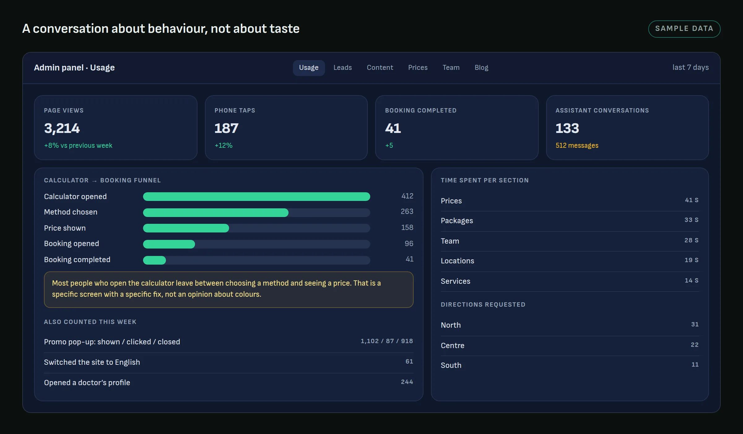
The clinic manages its own content, prices, promotions and team from the panel. That is table stakes. The part that changed how the site is run is the usage tab.
Every meaningful action on the site is counted: sections viewed and how long, calculator steps, booking opened and completed, assistant conversations, phone taps, requests for directions per location, the promotional pop-up shown, clicked or closed, language switches. The panel shows them as a funnel and as a week-over-week table.
The reason for including it is that without it, every subsequent conversation about the site is a conversation about taste. With it, it is a conversation about behaviour. You can see that the calculator gets opened and abandoned between choosing a method and seeing a price, and that is a specific screen with a specific fix. The same panel holds the leads from the advertising campaign page, each with the campaign and ad it came from, and a call queue where reception marks the outcome of every attempt. Advertising tags are loaded on the campaign pages only, so the rest of the site sets no marketing cookies for a visitor who did not click an ad.
What we carry forward
A bilingual site is not a site with a translation. Every text field exists twice; the structure exists once. The two language versions carry different expectations about what matters and in what order it gets read, and that shows in the copy, not in the layout.
The second lesson is older than the web: instrument before you argue. A panel that shows what people do turns a redesign debate into a list of specific screens.
Running several sites with one website that joins them awkwardly? Get in touch.