KPI dashboard for business: what it is and how to choose one
Most conversations about a KPI dashboard start with the tool: which platform, what it costs, whether there is a mobile app. That is the third question. The first two are what you actually need to see, and where each number is going to come from.
This guide is for an owner or manager of a small or mid-sized business who already has the numbers, spread across accounting, a CRM and a few spreadsheets. It draws on the dashboard we run for a clinic with three locations, without naming it; the pictures use sample data.
What a KPI dashboard is, and what it is not
Three different things get called by one name:
- A report is a photograph of the past. It gets opened monthly, usually because somebody asked for it.
- A BI platform is a tool a trained person uses to build analyses. It is powerful, and it assumes somebody will give it time.
- A KPI dashboard is a small set of numbers showing whether the business is going the right way now, and each of them leads to an action.
If what you are being sold requires you to open it and go looking, that is a report with better styling. A dashboard should tell you something without being interrogated.
Which numbers earn a place
A useful filter: for each number, ask what you would do differently if it moved. If there is no answer, it is not a KPI, it is an interesting fact.
In practice, for most service and trade businesses the core is small:
- Revenue against expenses, month by month, not just in total.
- Performance against the target for the period.
- A few operational numbers specific to the business: utilisation, request volume, average order value, overdue receivables.
Which the third group are depends on you, and that is normal. A dashboard whose categories do not match the language a team uses in its own meetings stops getting opened. Why that is decisive, and what else happens before the first line of code, is the subject of a separate piece linked at the end.
Where the numbers come from
This is where most of these projects fail, and they fail quietly.
Every number comes from somewhere: accounting software, a till system, a CRM, a bank statement, a spreadsheet somebody maintains. For each one, the answer to "can this be pulled automatically" is yes, no, or "yes, with work".
The dangerous category is the third, because during a scoping conversation it sounds exactly like the first.
Do this on paper before you talk to any vendor: write the ten numbers you want, and next to each one its source. If three of them say "Ivan emails it every Friday", you already know where the dashboard will break and when. It will be the week Ivan is on leave, which is reliably also the week the numbers matter most.
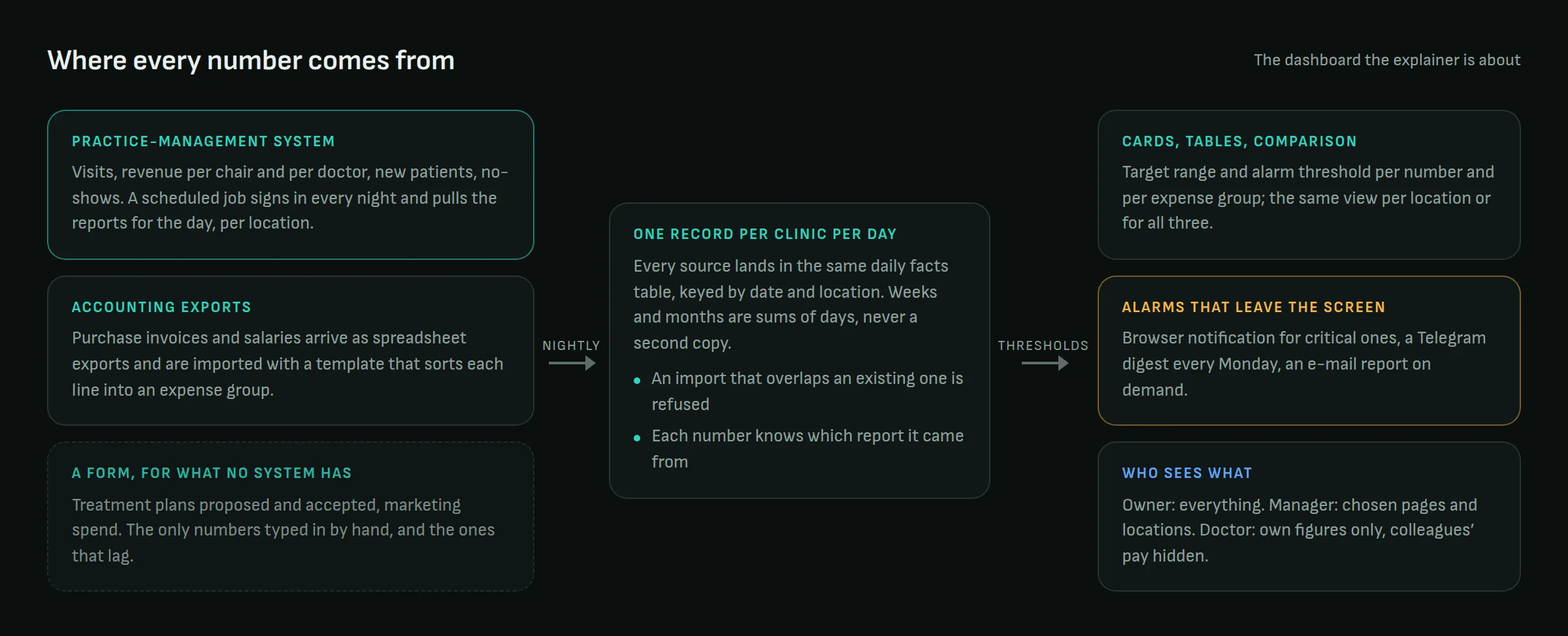
What "automatic" means in practice is less glamorous than it sounds. In the dashboard above, a scheduled job signs in to the practice-management system every night and downloads the same reports a manager would open by hand. Invoices and salaries come in as spreadsheet exports through a template that sorts each line into an expense group. No integration partner, no API agreement, no waiting. It is unglamorous, and it has run every night since.
Off-the-shelf or custom
Off-the-shelf is fast, cheap to start and paid monthly. It works well when your data already sits in systems it knows about.
Custom earns its cost when your data is scattered across things that do not know about each other, or when the shape of your business does not fit somebody else's model: several sites with different rules, industry-specific units, roles that should see different numbers.
The honest calculation: if the integrations you need already exist in the off-the-shelf product, buy the off-the-shelf product. Building is justified when the connecting is the real work rather than the decoration.
Who looks at it, and how often
A dashboard without a named audience becomes nobody's. Before it is built, it is worth knowing who opens it, how often, and what they do next.
Three audiences want three different screens. An owner wants few numbers and a trend. A manager wants operational figures for the week. A team wants their own slice, not the whole picture.
Trying to serve all three on one screen usually produces a screen where the eye has nowhere to land.
One number, per site
If you run more than one location, insist on seeing the same numbers per site, not only in total. An average is where problems go to hide.
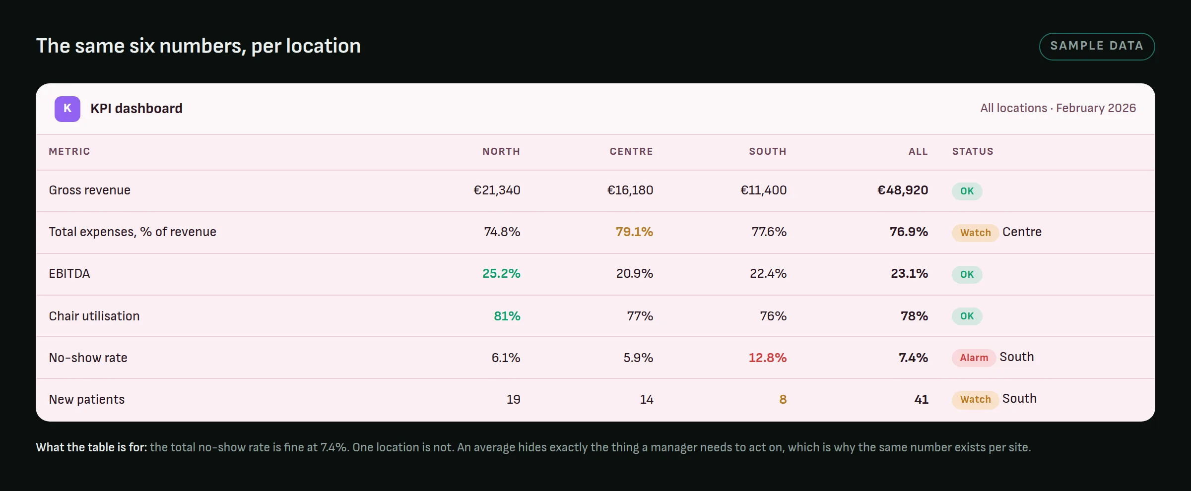
In the table above the overall no-show rate is comfortably inside its limit, and one location is far outside it. Nothing about the total would have told you that, and the action (a reminder call the day before, at that site) is specific to the site.
Who sees what
Permissions get asked about last and belong near the front. If the dashboard shows salaries, margins or per-person results, access is not a technical detail.
The minimum that works: roles where each person sees their own site or their own team, plus a separate role that sees everything. Without it, a second dashboard "just for management" appears, and the two start to disagree.
An alarm, not a view
A number with a target range and a notification when it leaves that range turns the dashboard from something you look at into something that comes looking for you. The difference is practical: the first requires discipline, the second does not.
Notifications have a tolerance threshold, though. Three a week get read. Thirty get muted, and the three that mattered go with them. A split that works: critical alarms immediately, everything else in one weekly digest.
Rolling it out without abandoning it
An order that lowers the risk:
- Five numbers, not twenty. The rest get added once the first five are actually being watched.
- Automatic ones first. A number that needs a manual export waits until there is an automatic path to it.
- One quarter with real data before drawing conclusions from it.
- A review after a month. Which numbers were genuinely looked at and which were not. The ones that were not come off.
Step 4 is the one that gets skipped, and it is precisely the one that keeps a dashboard from turning into an archive.
Common mistakes
- A metric with no target. "Revenue €48,000" carries no decision until you know whether €48,000 is good.
- Too many numbers on one screen.
- Data that lags by a month, presented as "real time".
- Categories taken from a chart of accounts rather than from how the team talks.
- A dashboard built to show an investor, then used to run operations.
- Totals without a per-site view, when there is more than one site.
When you do not need one
If you are a handful of people and every number fits in one spreadsheet that somebody genuinely maintains, a dashboard will cost you more attention than it saves.
The case appears when the numbers live in different systems, when more than one person needs to see them, or when you have already missed something because you saw it too late.