A KPI dashboard people actually use
Most KPI dashboards die quietly. Everyone opens them for the first fortnight, then somebody notices a number that does not reconcile with accounting, trust cracks, and a month later the dashboard is one more tab nobody clicks.
The problem is rarely technical. It is almost always in the decisions taken before development started. This piece walks through those decisions using the dashboard we built for a dental practice with three locations, because an argument with a real example is worth more than one without. Every figure shown here is sample data; the shape is the real one.
What we were asked to build
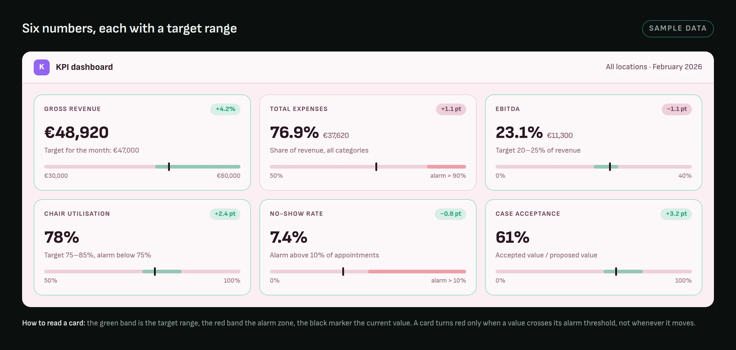
The owner had the numbers. They were spread across the practice-management system (visits, revenue per chair and per doctor, new patients, no-shows), a pile of accounting exports (purchase invoices, salaries), and a spreadsheet or two that somebody updated when they remembered. Three locations, each with its own habits, and one person trying to see the whole practice at once.
The request was the usual one: "a dashboard". What was actually needed was an answer to a narrower question, asked every Monday: is any location drifting, and where exactly.
The numbers have to arrive on their own
If somebody has to export a report and upload it by hand, the dashboard is dead on the drawing board. Not because people are lazy, but because the manual step gets skipped in exactly the weeks you are busiest, which is exactly when the dashboard matters most.
Our first version leaned on exports pasted into an import form, and it behaved precisely as predicted: the data was complete for the first month and patchy from the second. So we built the boring thing. A scheduled job signs in to the practice-management system every night and pulls the day's reports for each location, the same reports a manager would open by hand. Purchase invoices and salaries still arrive as spreadsheet exports, but through a template that sorts each line into an expense group, so an import is a drop rather than a data-entry session.
Two kinds of numbers survived as manual fields, because no system holds them: treatment plans proposed and accepted, and marketing spend. They are the numbers that lag, every month, and that is not a coincidence. If a metric cannot be pulled automatically, the honest choice is between building the path or dropping the metric. Keeping it as a field that is permanently out of date is the option that costs trust.
One record per clinic per day
The moment one number disagrees with accounting, the dashboard has to be able to explain itself, or it loses the argument. So the data model is deliberately dull: one record per location per day, for every operational figure. Weeks and months are sums of days, never a second copy that could drift. An import that overlaps a period already loaded is refused rather than silently doubled, and every number keeps a pointer to the report it came from.
None of that is visible on screen, and all of it is why the screen is still open six months later.
A metric without a threshold is not a metric
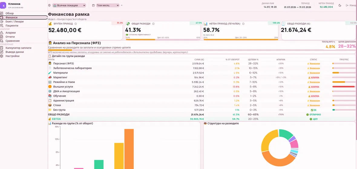
A number on its own does not carry a decision. "Revenue €48,000" tells you nothing until you know whether €48,000 is good.
Every number on the dashboard has a target range, and most have an alarm threshold on top. Expenses are tracked as a share of revenue per group, and the defaults we ship are the benchmarks a dental practice would recognise: laboratory costs at 10 to 15 per cent with an alarm above 18, materials at 6 to 10 with an alarm above 10, marketing at 5 to 7 with an alarm both above 8 and below 3. That last one surprises people. Spending too little on marketing is a problem a dashboard can catch months before the appointment book does.
Operational numbers work the same way: chair utilisation with a target of 75 to 85 per cent and an alarm below 75, a no-show rate that raises an alarm above 10 per cent of appointments, case acceptance as accepted value over proposed value.
An alarm that comes looking for you
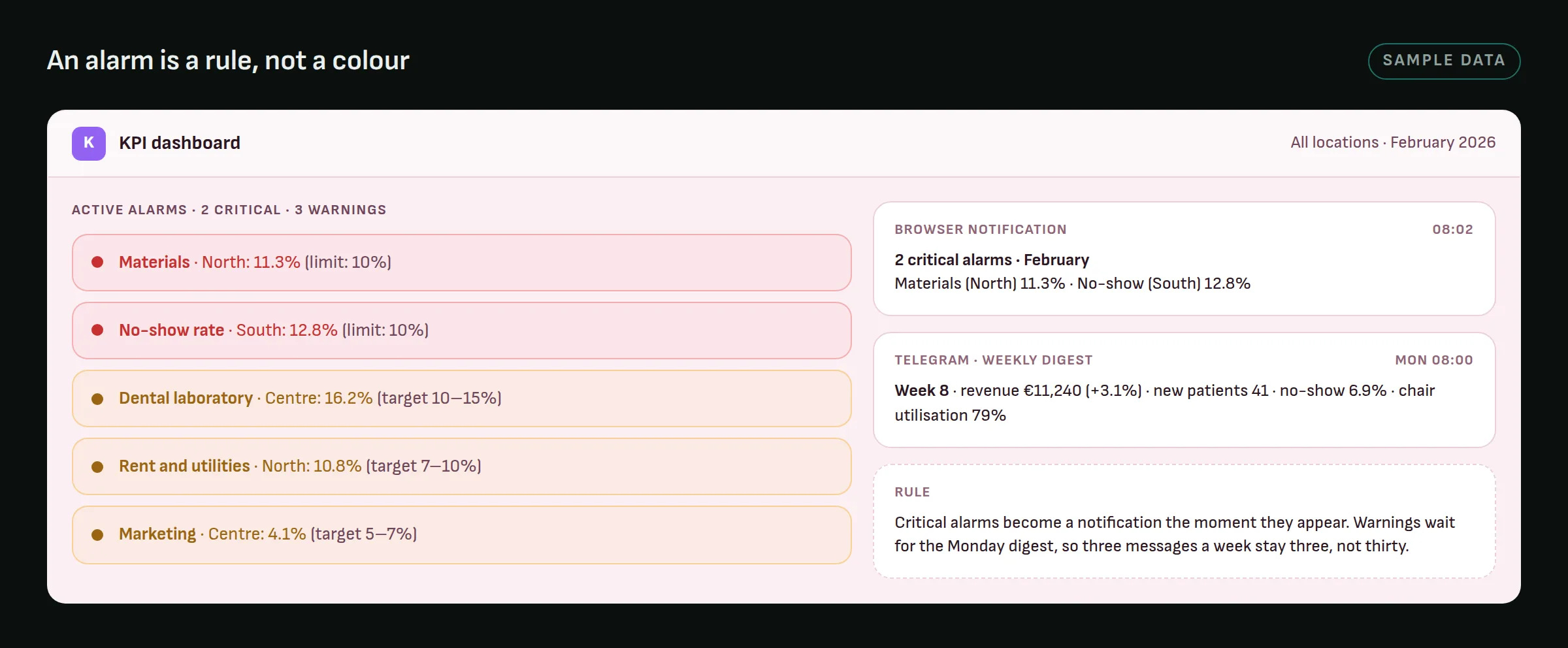
A threshold turns the dashboard from something you look at into something that comes looking for you. The difference is practical: the first requires discipline, the second does not.
Two channels carry alarms out of the screen. Critical ones surface as a browser notification the moment they appear. Everything else waits for a Telegram digest on Monday morning, which sums up the week per location. The split is deliberate: notifications have a tolerance threshold. Three a week get read. Thirty get muted, and the three that mattered go with them.
Fewer metrics than you want
The natural impulse is to include everything measurable. The overview page can show ten cards; the owner looks at six, and the rest exist for the days a specific question comes up.
The working rule we use: if you cannot say what you would do differently because of a metric, it is not a KPI, it is an interesting fact. Interesting facts can live in a report you pull when you need it.
The one place where more is better is the comparison across locations. An average no-show rate of 7 per cent looks fine; the location running at 13 does not. The same six numbers exist per site for exactly that reason.
Built around how the team already talks
A dashboard should not require the team to change how they work in order to feed it. The expense groups are named as the practice's accountant names them, not as a chart of accounts would. Locations carry the names staff use. And because the question "what does this month's payroll come to" gets asked in the same meeting as "how did we do", a payroll calculator under Bulgarian labour law lives in the same tool, not in a separate spreadsheet.
If a dashboard's categories do not match the ones people already think in, every glance requires a silent translation, and that translation is precisely the friction that kills the habit.
Who sees what
Permissions get asked about last and belong near the front. The owner sees everything. A manager sees a chosen set of pages and locations. A doctor sees their own figures, with colleagues' pay hidden. Without that, a second dashboard "just for management" appears within a month, and the two start to disagree.
What we would do differently
The first version had a single shared login and database rules that trusted the browser. That was fine for one owner on one laptop and disqualifying the moment a second practice asked for the same product, so real accounts and server-side rules went in before anyone else could log in. It should have been there on day one.
And the two hand-typed fields are still hand-typed. We know where the dashboard breaks and when: the week the person who types them is on leave.
In short
A dashboard that works has few metrics, each arriving automatically, each with a threshold, each leading to a specific action, and each able to say where it came from. Everything else is decoration, and decoration has weight.
If you are thinking about a dashboard like this, tell us what you track today and how. The most useful conversation usually starts from the reports you already have, not from a blank page.